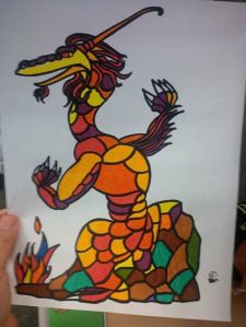
I will put this forward, although I don’t get too much feedback on here, I’d love to hear from folks. I’ve wanted a tat of the cover of the book for a long time, and I envisioned it looking like stained glass. I made a bunch of copies (I didn’t want to color the original, which is on really good paper, too) and messed with the color scheme. Which of the 3 do YOU think looks best?
They are similar, but not alike. And I won’t say which one I’m leaning towards until I get some feedback. Speak up, peoples! Please!!


Leave a comment